Roghsire Font: Elevating Digital Brand Identity
I was staring at a Figma file for a new boutique skincare client last Tuesday, and something just felt off. The layout was clean, the photography was ethereal, and the color palette was perfectly muted. Yet, the hero section lacked that intangible sense of luxury we were aiming for. The previous typeface choice was safe but forgettable. That is when I decided to test Roghsire. Within minutes of dropping this display font into the main headline, the entire digital atmosphere shifted. It wasn't just text anymore; it was a mood. For web designers and digital creators chasing that elusive premium feel, finding a typeface that balances classic elegance with modern screen readability is often the hardest part of the branding process.
First Impressions in the Hero Section
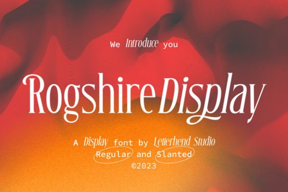
Roghsire immediately distinguishes itself as a stylish display font with chic classic looks. When I applied it to the primary H1 tag on the landing page, the difference in visual weight was apparent. Unlike many decorative fonts that sacrifice legibility for flair, Roghsire maintains a structured integrity. The letterforms are carefully constructed to ensure a premium quality that translates surprisingly well to backlit screens. In my test project, the font didn't just sit on top of the background image; it anchored the composition. The contrast between the delicate serifs and the bold stroke width created a natural focal point that guided the user’s eye exactly where we wanted it: toward the value proposition and the primary call-to-action.
What struck me most during this initial layout phase was the personality it injected into the brand identity. We weren't selling soap; we were selling a ritual. Roghsire communicated that narrative without needing extra copy. It serves as an excellent example of how modern typography can do the heavy lifting in UI design, reducing cognitive load by visually reinforcing the brand message before the user even reads a single word of body text.
Leveraging the Slant Version for Dynamic Layouts
One specific feature that saved my grid system was the included Slant Version. In web design, static headers can sometimes feel too rigid, especially on mobile devices where vertical space is precious. I utilized the slanted variant for secondary section headings and promotional banners. The angle introduced a sense of forward momentum and energy that the upright version, while beautiful, didn't quite possess. This variation proved invaluable for creating visual hierarchy without switching typefaces entirely. It allowed me to maintain brand consistency while clearly signaling to the user that they were entering a different content zone, such as a testimonial slider or a limited-time offer block.
For digital product creators building templates or course sales pages, this versatility is a massive time-saver. Instead of hunting for a complementary script font or italic alternative that might clash, having a stylistically matched slant version ensures your design assets remain cohesive across every breakpoint.
Readability and Responsive Behavior
As any UX-aware designer knows, a font that looks stunning at 72px on a desktop monitor can become illegible mush on a smartphone. I was initially skeptical about using such a high-contrast serif font for responsive headers. However, Roghsire held up remarkably well during mobile testing. The key here is scale and spacing. On smaller viewports, I increased the letter-spacing slightly and bumped up the font size relative to the container width. The generous x-height and open counters prevented the letters from collapsing against each other on narrow screens.
I would advise against using this typeface for long-form body copy or dense paragraphs. It is strictly a display workhorse. For body text, pairing Roghsire with a clean, neutral sans serif font like Inter or DM Sans created the perfect editorial balance. The simplicity of the supporting text allowed the display font to shine without overwhelming the reader. This pairing strategy is essential for maintaining scannability and ensuring that the luxury aesthetic doesn't compromise accessibility or user engagement metrics.
Practical Applications Across Digital Touchpoints
Beyond the main website header, I found Roghsire to be exceptionally versatile for various digital branding needs. Here is how it performed across different real-world applications during the project:
- Logo Design: The classic structure makes it an instant candidate for wordmarks. It requires minimal customization to look bespoke and established.
- Social Media Graphics: When creating Instagram carousels and Pinterest pins, the font retained its crispness even when exported as compressed JPEGs. It adds immediate authority to quote cards and announcement graphics.
- Email Marketing Headers: Using web-safe fallbacks is always a concern, but when embedded correctly in HTML emails, Roghsire elevated the perceived value of our newsletter campaigns significantly compared to standard system fonts.
- Product Packaging Mockups: While primarily digital, seeing the font on packaging mockups helped bridge the gap between the physical product and the online store experience, creating a unified brand touchpoint.
Technical Considerations for Web Implementation
Before committing to Roghsire for a live client site, there are practical technical checks every web designer should perform. First, verify the commercial font licensing. If you are building a site for a client or a digital template for resale, ensure your license covers web embedding and the expected monthly page views. Nothing kills a project launch faster than a licensing compliance email post-deployment.
Next, check the file formats. For optimal web performance, I converted the OTF files to WOFF2. This reduced the file size significantly, helping us maintain a high Lighthouse performance score despite adding a custom typeface. Also, explore the OpenType features. Roghsire includes alternates and ligatures that can prevent awkward character collisions in specific headlines. Accessing these via CSS font-feature-settings allows for micro-typographic adjustments that polish the final design.
Finally, consider your color contrast ratios. Because this is a high-contrast typeface with thin hairlines, using it in pure white on a light gray background failed WCAG accessibility standards in my initial audit. Switching to a deep charcoal or rich navy on a cream background not only solved the accessibility issue but actually enhanced the luxurious vibe. Dark mode implementations require special attention here; you may need to increase the font weight or adjust the opacity slightly to prevent the thin strokes from vibrating against dark backgrounds.
Building Trust Through Typographic Consistency
Ultimately, choosing Roghsire was about more than just aesthetics; it was about building trust. In the digital space, users make split-second judgments about credibility based on visual presentation. A sloppy or generic font signals a lack of attention to detail. By implementing a typeface that feels intentional, premium, and carefully crafted, we signaled to the user that the brand cares about quality in every aspect of their business. This psychological impact is difficult to quantify in analytics, but it is palpable in the overall user experience.
For fellow designers and entrepreneurs looking to elevate their next project, Roghsire offers a sophisticated solution that bridges the gap between traditional editorial design and modern web usability. It reminds us that even in a digital-first world, the classic principles of typography still reign supreme. Whether you are designing a coaching website, a high-end e-commerce store, or a personal portfolio, this font provides the foundational elegance needed to make your digital presence truly memorable.